Bytesize Learning,
Tech education for youth
A UX redesign project
UX Researcher & Visual Designer
MY ROLE
ByteSize Learning
CLIENT
4 UX Researcher & Designers
TEAM
DURATION
3 Weeks
INDUSTRY
Ed-Tech
OVERVIEW
ByteSize Learning provides online courses to learners aged 8-18, with a mission to make technology more accessible to young learners, especially those who come from underprivileged backgrounds. Their goal is to empower young learners to keep up with the modern world by equipping them with practical tech skills.
What We Set Out to Accomplish
We redesigned the Bytesize Learning website, which included conducting business analysis, user research, creating journey maps, synthesizing user pain points, and designing a new interface. We conducted usability testing and provided a comprehensive Spec Doc after multiple iterations based on client feedback.
Problem Statement
How might we create an engaging and fun platform for kids to learn practical tech skills, while also giving parents the peace of mind that their children are being taught by knowledgeable instructors?
Design opportunities
A modern interface with intuitive navigation
Integrating gamification: educational games, trivia, interactive videos.
changing the color scheme & typography to be professional yet kid-friendly
Ensure intuitive navigation through consistent design.
Create a section for reviews and testimonials for learners and parents to establish trust and credibility.
Improve branding and attract more customers through our redesigned website.
Outcome
Our redesign aimed to improve the experience of using Bytesize Learning's website, with the goal of making it more engaging and satisfying for both young learners and parents. The new platform is more user-friendly, interactive, informative, and aligned with Bytesize's mission of making technology more accessible to young learners.
RESEARCH PHASE
Goal of Reserach
Understanding the needs, goals, and pain points of our target audience to create a user-centered design for the Bytesize Learning platform.
Challange
Collecting insights from young learners posed a challenge for us. Finding willing and accessible participants wasn't easy, and even when we connected with them, collecting data presented its own difficulties due to their :
Shorter attention spans
The tendency to be distracted
Hesitance to talk to adults
Business Model Canvas
allowed us to identify key components of our business model and assess our revenue streams.
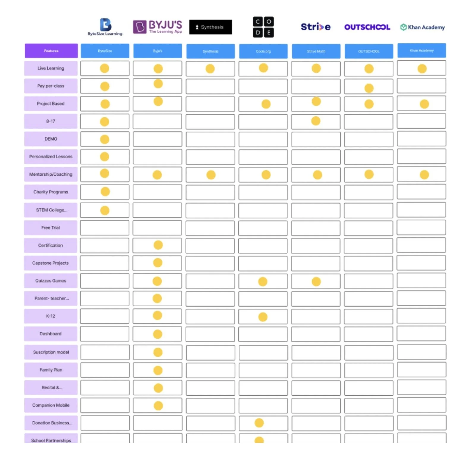
Competitive Analysis and Competitive Matrix
helped us analyze our direct and indirect competitors, their strengths and weaknesses, and identify opportunities for differentiation.
Holistic Research Approach and Analysis Techniques
Business Analysis
During our business analysis phase, we used various techniques to gain a better understanding of the market, competitors, and the needs of our users.
Feature Prioritization Matrix assisted us to determine which features were essential for the ByteSize platform and prioritize them based on user needs and business goals.
MosCoW Matrix helped us categorize features as must-haves, should-haves, could-haves, and won't-haves, allowing us to make informed decisions and streamline the development process.
INTERVIEWS
Challenge
Interviewing kids and teenagers presented challenges, such as difficulty in expressing opinions and ensuring age-appropriate, understandable questions. However, my experience teaching children helped me effectively communicate and gather valuable insights, which were crucial in designing an user experience tailored to their needs.
What we learned from our audience...
Following our business analysis, we were able to identify areas for improvement in Bytesize's website, as well as highlight what sets them apart in the market. Now, it was time to better understand our audience so we conducted interviews with two key groups: Learners and Parents.
Interview Insights:
Personalized learning experiences and flexibility are essential.
Demand for a gamified and engaging user experience for learners.
Majority of parents and learners prefer a project-based lesson plan.
Social interaction and collaboration are crucial.
Instructor backgrounds build trust and credibility.
SYNTHESIS
Making sense of our findings
After interviews and gathering information, we created an affinity diagram to synthesize our findings. This allowed us to group similar insights and identify patterns and themes, which helped us develop a better understanding of our customer’s needs, goals, and pain points.
Prioritizing most-needed features
To prioritize features for the Bytesize website redesign, we used two matrices: the MosCoW Matrix to categorize features by importance, and the Feature prioritization matrix to rank them by cost and effort. This enabled us to make informed decisions about identifying critical features for the ByteSize platform.
PERSONAS
PARENT PERSONA
LEARNER PERSONA
JOURNEY MAPS
Visualizing the experience of our audience
We created journey maps to understand our user’s experiences and identify improvement opportunities at different journey stages.
DESIGN PHASE
Bringing Ideas to Life
After gathering insights from our user research, we began the design phase, creating a user-centered website that would meet the needs and expectations of our users and also align with the client's mission. We continuously referenced our research insights and incorporated feedback from users and stakeholders to ensure that the platform was tailored to their needs.
What makes our platform shine!
Flexible and accessible
Personalized and project-based learning experiences
Gamified and interactive educational content
Success tracker to track progress and motivation
Alternative to traditional online learning options.
Sketching
Generating Ideas Through Collaborative Sketching
We started our design phase using the design studio(crazy 8) process involving brainstorming, sketching, and refining designs through critique and feedback to create a cohesive design direction.
Testing Ideas before final design
Using the design principles, the insights gathered from our research, and our design studio collaboration we created wireframes and a Mid-Fi prototype to visualize and test our design ideas with low effort in time and cost to see how the users interact with our design.
Mid-Fi PROTOTYPE
USABILITY TESTING ROUND I
Evaluates product usability with real users:
85% of learners and 54% of parents completed tasks directly.
15% of learners and 64% of parents completed tasks indirectly or failed.
Most tasks were rated 4 or 5 for easiness by learners and parents.
Some users had difficulty with specific tasks due to confusing taxonomy and difficulty finding certain information.
Users expressed a need for quicker access to parent and student testimonials, and more intuitive navigation to find information about courses and find FAQs.
Changes we learned are essential:
Improve navigation for finding courses and scheduling classes.
Rearrange the website layout and move FAQ to the Help page.
Clarify taxonomy to avoid confusion.
Improve color coding for pricing tiers.
Increase the prominence of reviews and feedback on the homepage.
How we visualized user pathways
We conducted two rounds (previous and proposed) of user flows and sitemaps to improve the user experience and information architecture of the Bytesize platform. Our findings helped us design a new proposed user flow and sitemap resulting in a more intuitive navigation experience.
USER FLOWS & SITEMAPS
EXISTING SITE MAP
EXISTING USER FLOWS
PROPOSED SITE MAP
PROPOSED USER FLOWS
Bringing the Final Design to Life
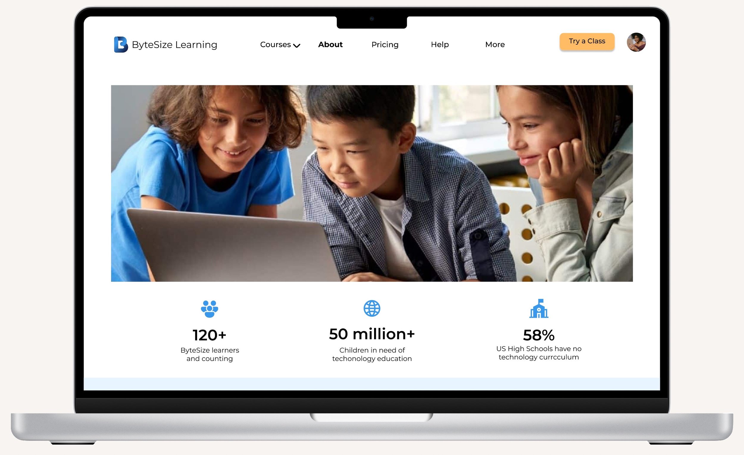
A fun, interactive & collaborative learning platform
That creates trust and credibility
And provides intuitive navigation
COMPONENT LIBRARY
Color Pallet
Typography
Key takeaways from two rounds of testing:
Navigation Improvements:
Moved FAQ to Help page.
Improved course and scheduling access.
Taxonomy & Layout:
Clarified taxonomy.
Rearranged layout for better organization.
UI Enhancements:
Redesigned pricing tiers and color coding.
Increased prominence of testimonials.
Feature Refinement:
Optimized user flows based on feedback.
Impact:
Task Completion: Learners (+35%), Parents (+50%).
Engagement: Boosted by 20%.
Ease of Use: Improved ratings from 4.2 to 4.7/5.
COMPARISON
What we learned:
Users struggled with navigation and unclear taxonomy, making it hard to find courses and information.
Increased visibility of testimonials boosted user trust and engagement.
Simplified layouts and clearer course access improved task completion rates.
Users preferred more engaging visuals and detailed course descriptions to enhance decision-making.
Final Recommendations
Additional Usability Testings:
Identify any issues and improve user experience
Engaging Visuals:
Fun avatars and imagery create a positive and friendly environment
Detailed Course Descriptions:
Help users make informed decisions and attract new users
All Courses Page:
Make it easier for users to browse and explore available courses
Emphasize Primary Offering:
Clarify the platform's primary offering and reduce confusion for users
Last Words
The goal of redesigning ByteSize Learning's website was to create an engaging, interactive platform that helps young learners keep up with modern tech. We focused on increasing engagement & satisfaction for both learners and parents, ensuring the platform met user needs and aligned with the client's mission to make technology accessible to all.


